Date: 2017 - 2019
Client: Green Dot Corporation
Role: Lead Designer
Green Dot is a financial technology and bank holding company that provides solutions to Americans who are unbanked with a range of prepaid, plastic debit cards, and digital banking options.
Over the years and different sources, the Green Dot portfolio products were lacking design cohesiveness.
















A new design language for all of Green Dot.
Green Dot needed a major redesign to create a stronger, recognizible and more reliable brand.
I refreshed the look and feel across all Green Dot products to make the brand cohesive, and make the products friendly, and easy to use, and ultimately build trust.
Less, but better. Back to purity, back to simplicity.


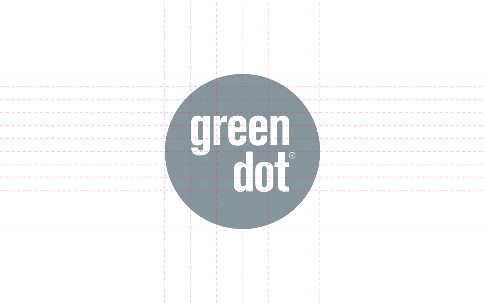
Shape • Color • Pattern



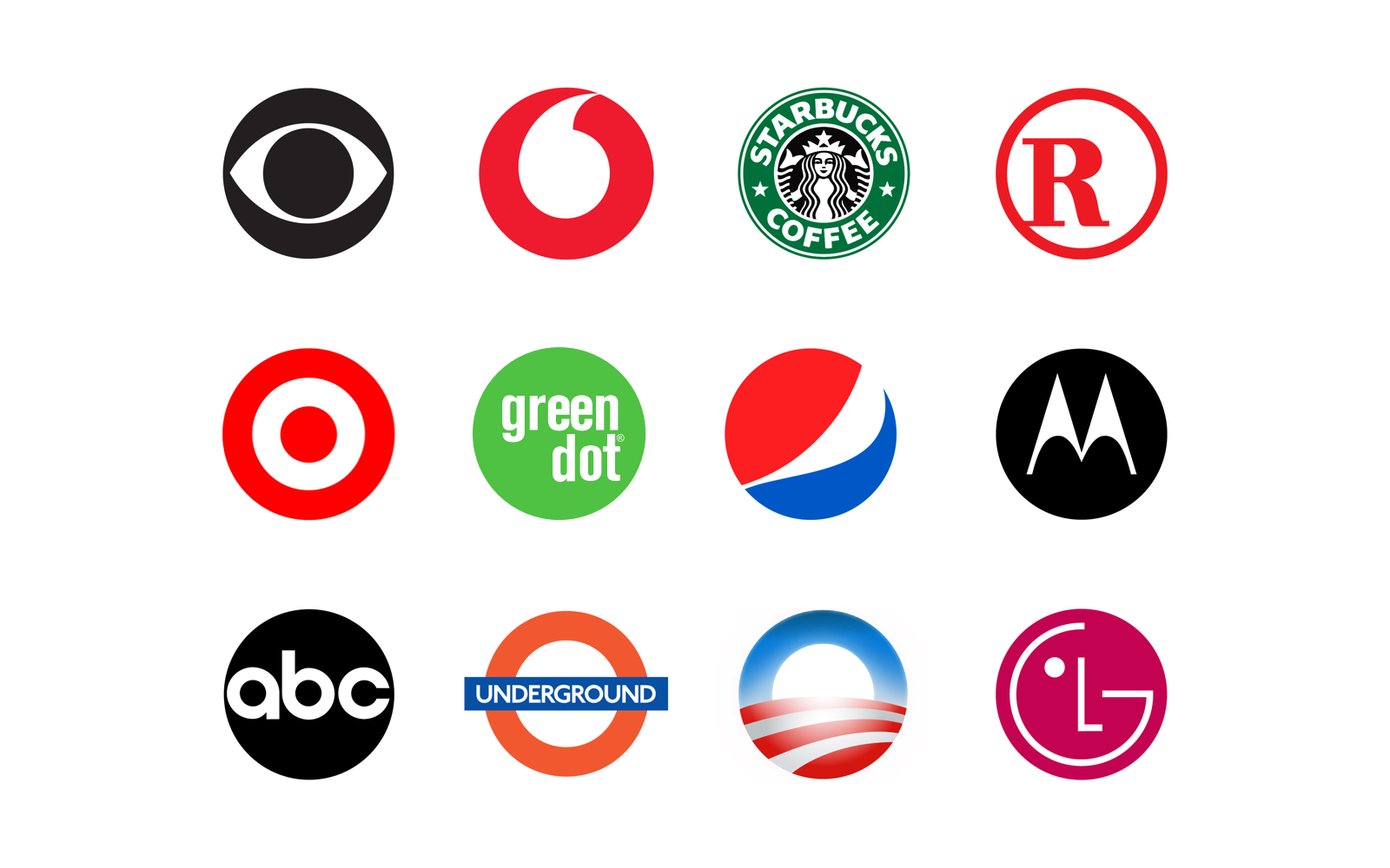
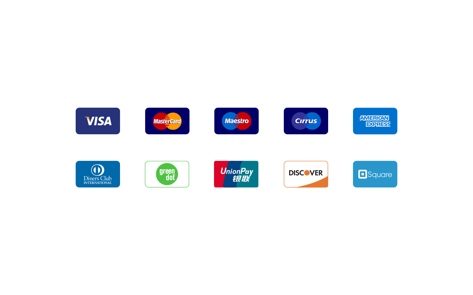
Comparison
A study of brands with a circular shape, and brands from related financial field.
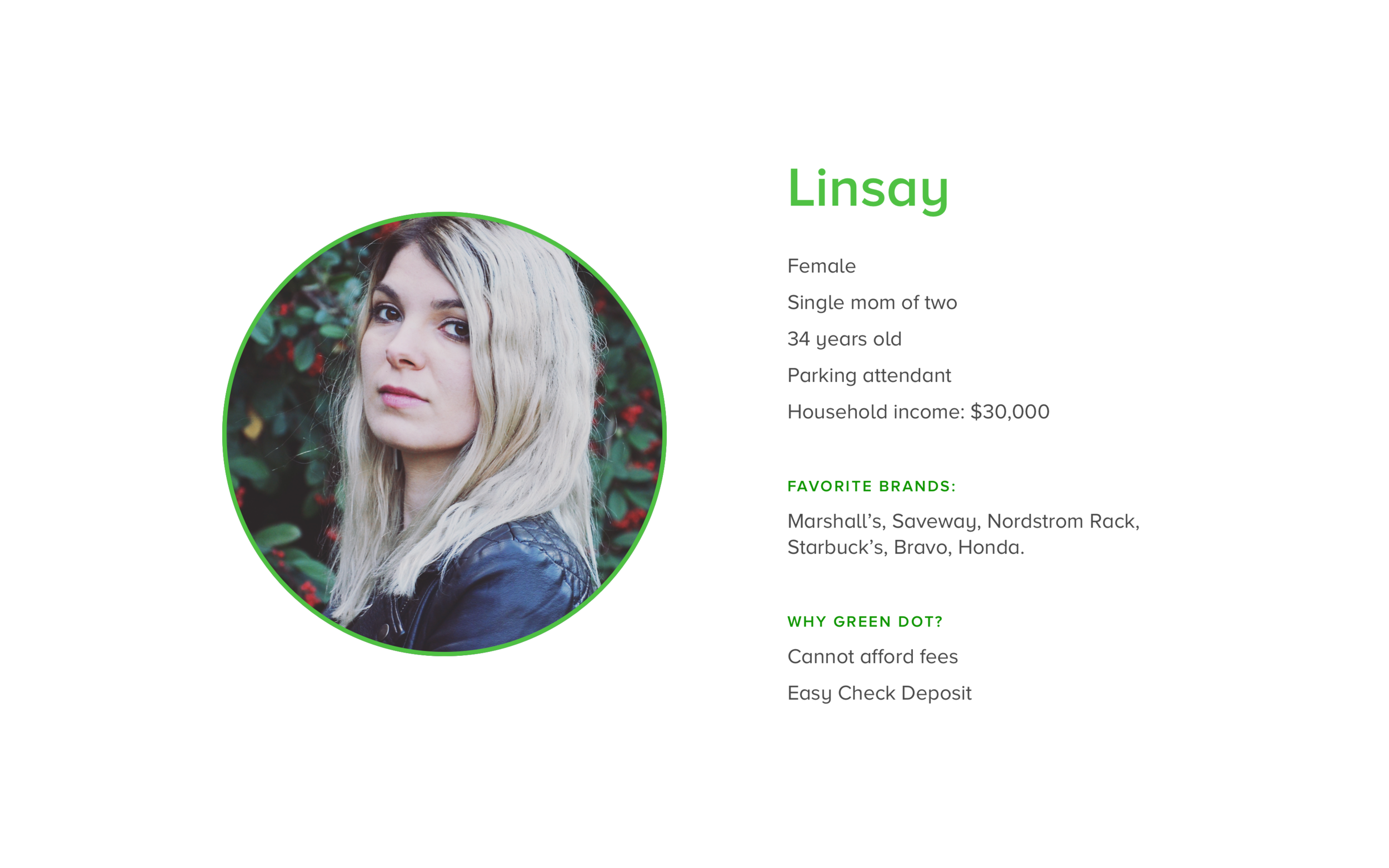
Target customer
The consumers were unbanked Americans, due to either distrust of major banks or an inability to use traditional banking services due to a poor credit rating.
We defined a customer persona to help build the most needed products to help our customers with their finances.

Mark
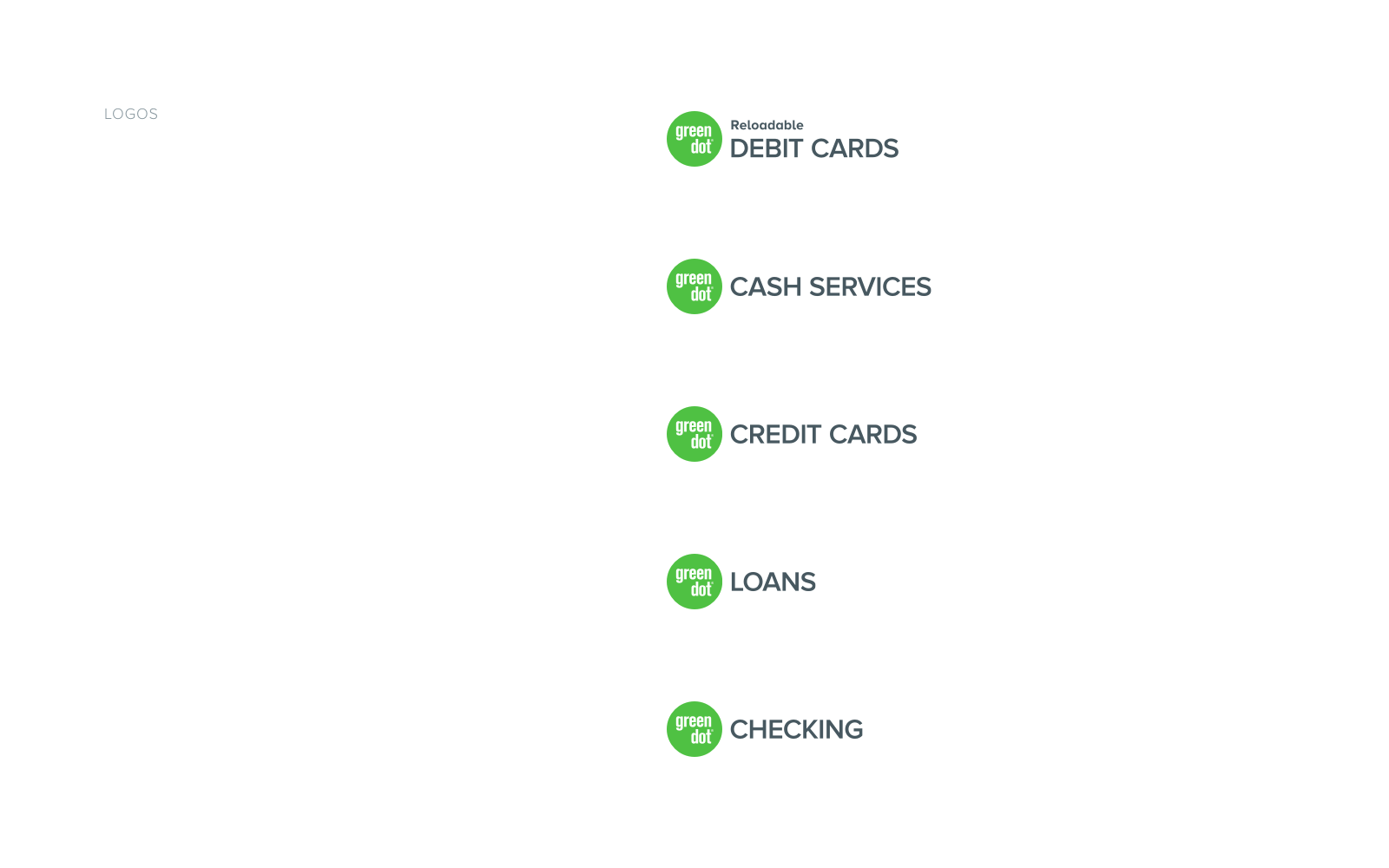
Logo lockups
Combination of the Green Dot mark and product name