Title: Visual Designer
Team: Product Foundation
Focus: Icon Design, System Development, Product Integration
Facebook Like: Evolving one of the most recognizable symbols on the internet
The Facebook Like is one of the most recognizable symbols in digital communication.
Over the years, it became more than an icon — it became a gesture embedded into internet culture.
The challenge wasn’t reinventing the Like. It was evolving a symbol billions of people already understood instinctively.
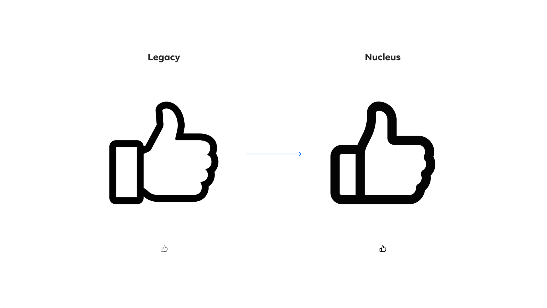
Before and After
Designing Inside Visual Memory
The original Like carried years of visual recognition embedded into its shape.
Even subtle adjustments to curves, angles, or proportions had a major impact on familiarity and readability. Every refinement needed to feel intentional — but almost invisible.
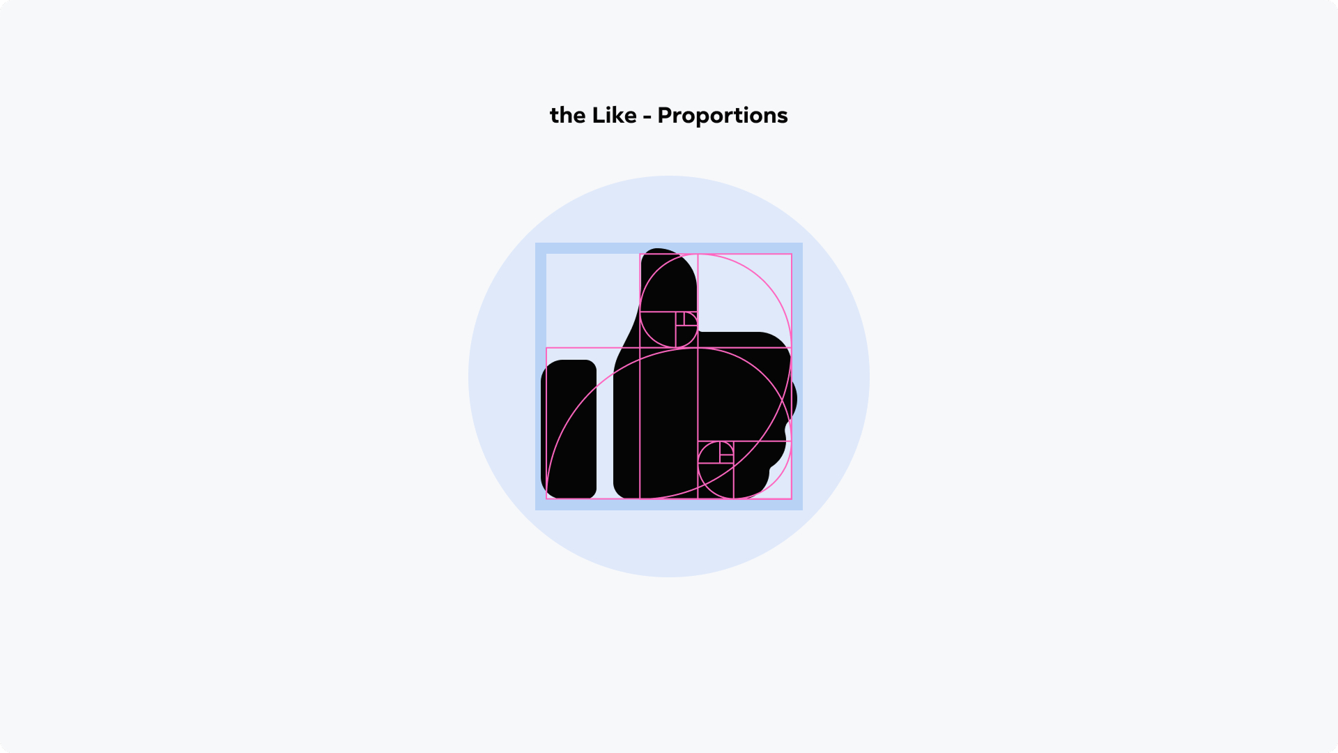
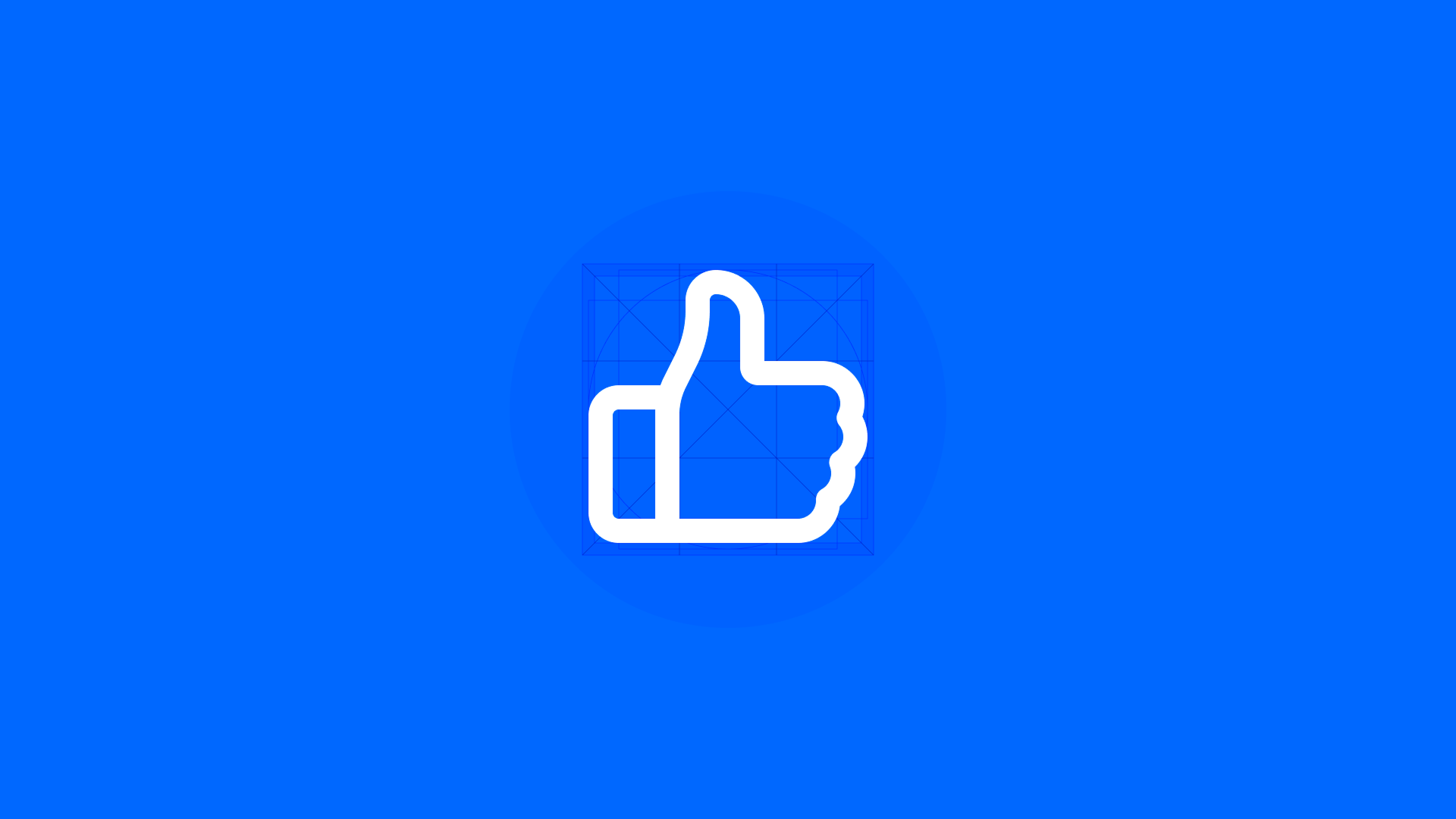
Golden ratio proportions

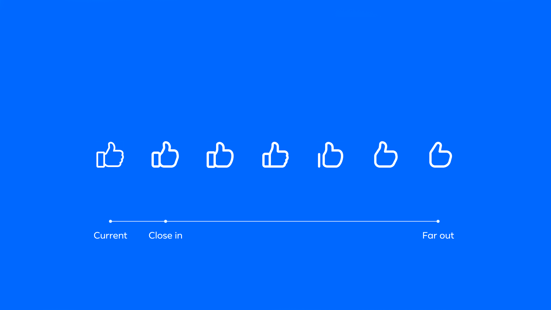
Finding the Core Shape
The evolution process explored a wide range of structural and optical refinements.
The goal was not stylistic change, but improved clarity, balance, and scalability across modern Facebook surfaces.
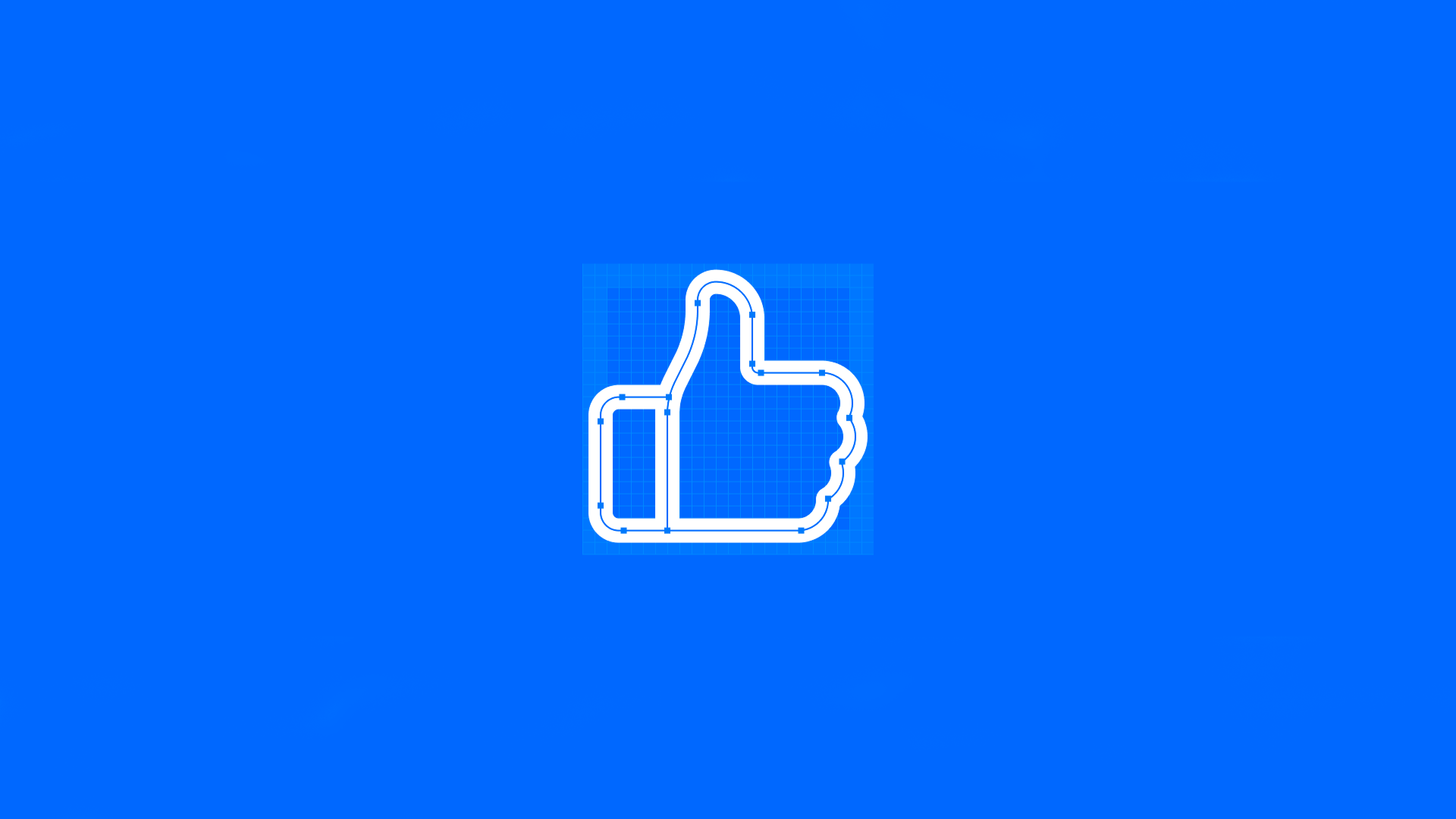
Precision Through Reduction
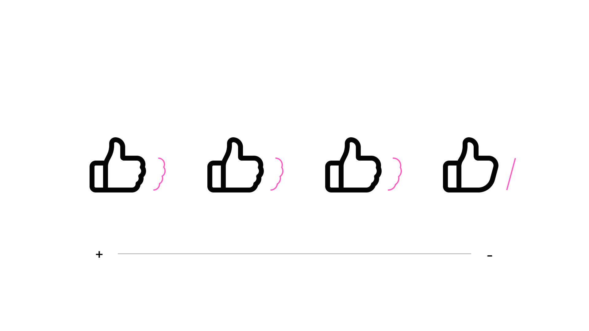
The final form was refined through hundreds of micro-adjustments.
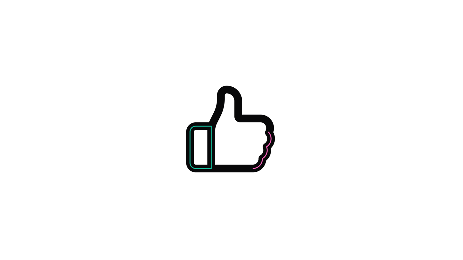
Spacing, silhouette, corner radii, and proportions were carefully tuned to preserve recognizability while improving consistency across sizes and contexts.

Shared Geometry
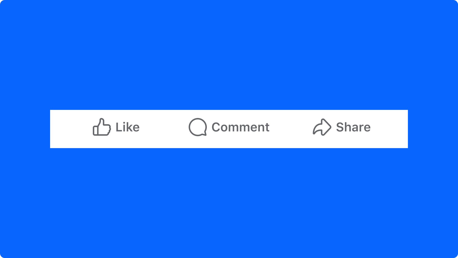
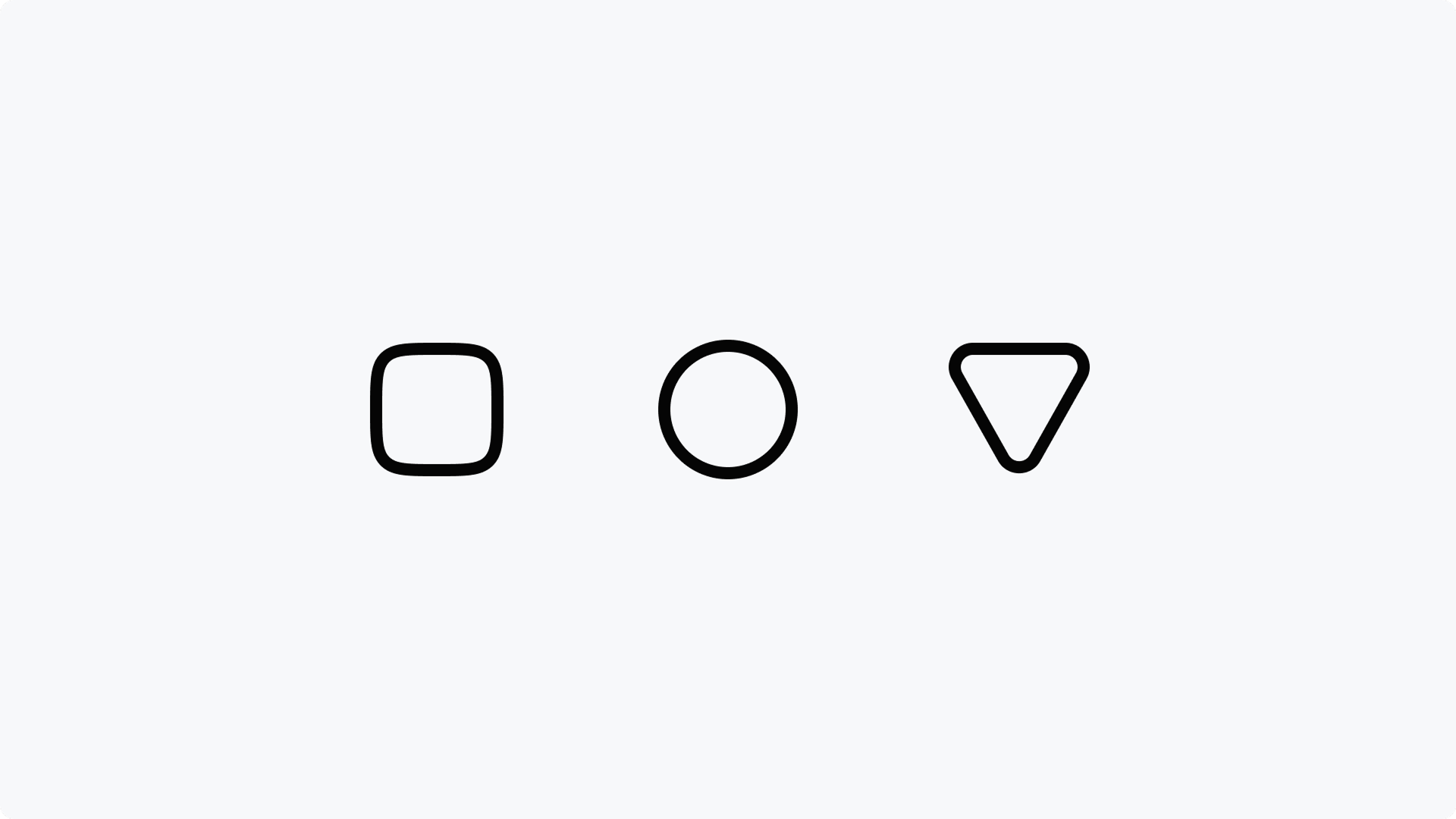
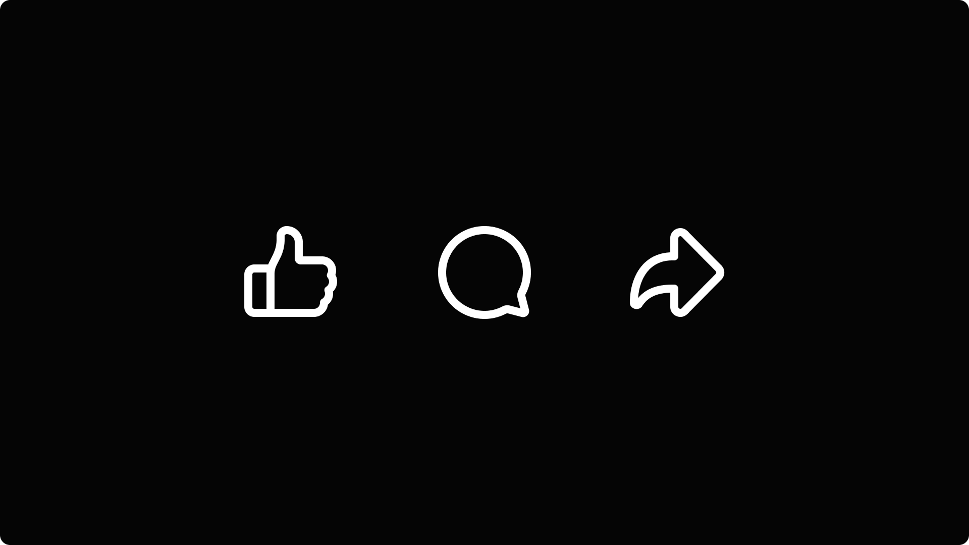
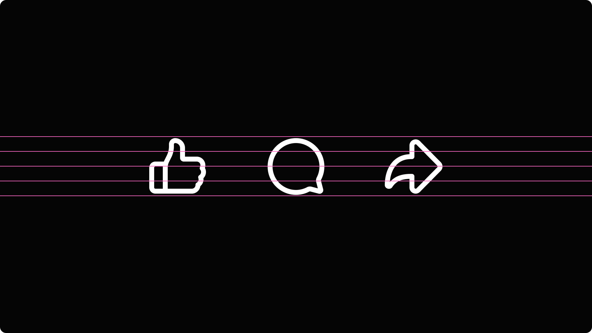
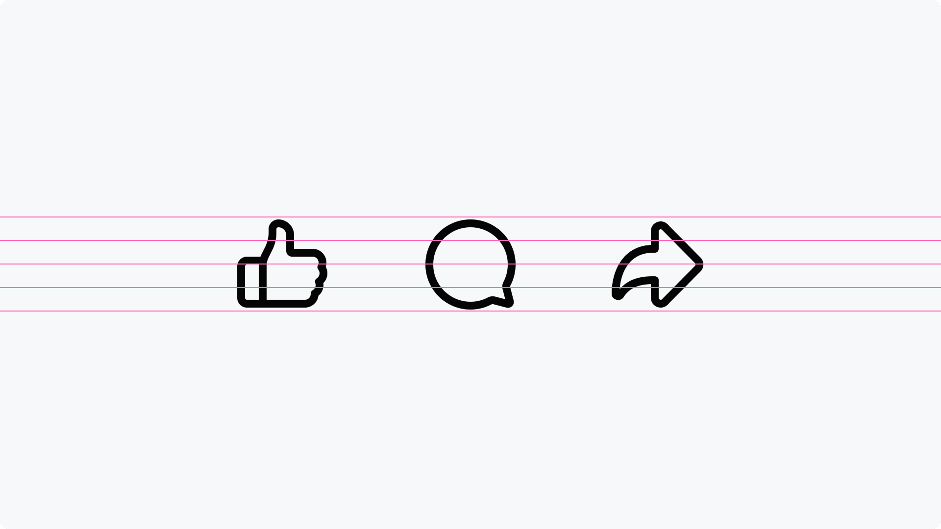
As part of the UFI exploration, the interaction system was studied through its most fundamental geometric forms.
Reducing the icons to simple primitives helped establish a more cohesive visual rhythm across the set while improving alignment, spacing, and scalability across product surfaces.
The goal wasn’t uniformity, but consistency — creating a system where each icon retained its own identity while feeling naturally connected to the others.

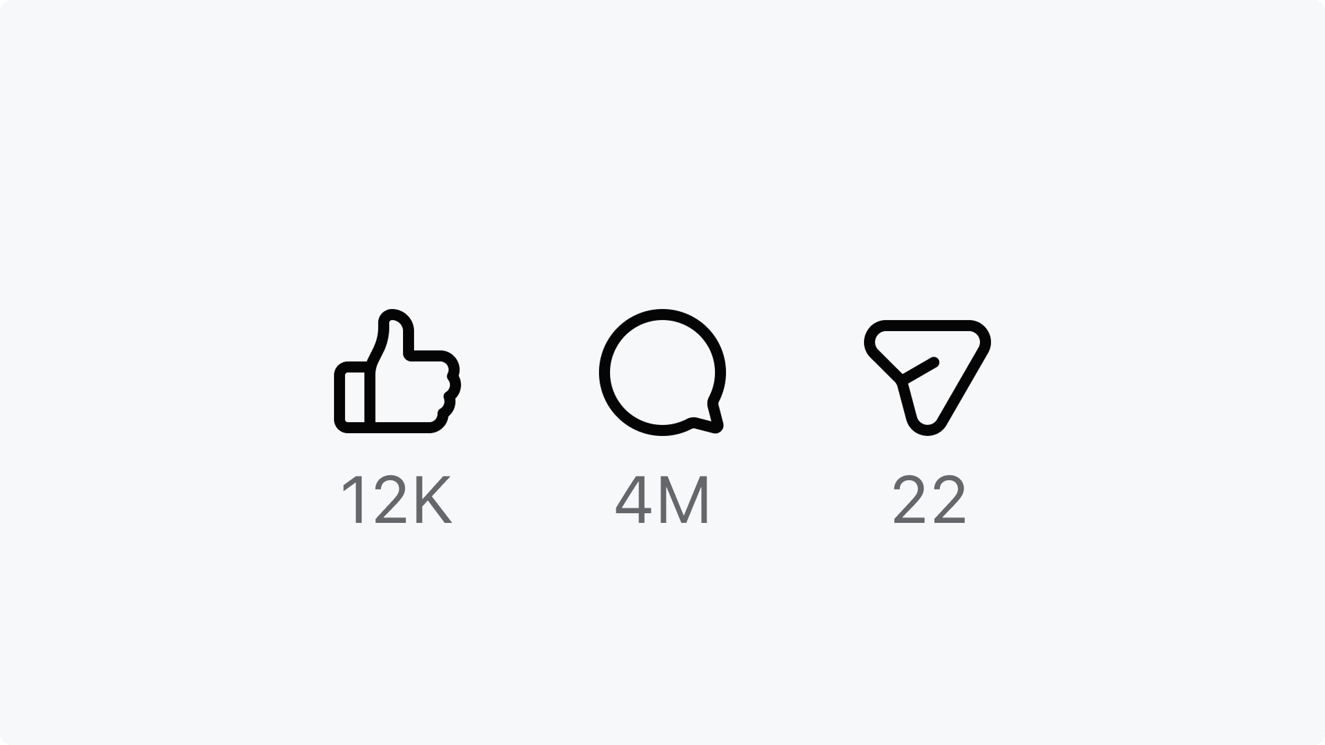
Built for Nucleus
The updated Like became part of Nucleus — Facebook’s unified iconography system.
The work extended beyond a single symbol into a broader framework designed for consistency, scalability, and long-term maintainability.
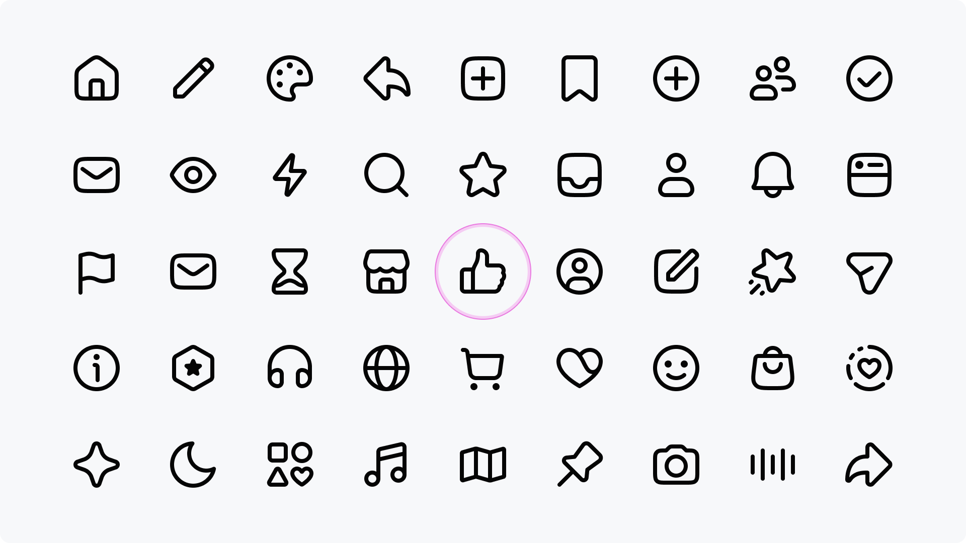
Outcome
The final system preserved the emotional familiarity of the original Like while modernizing it for a more unified and scalable visual language.
A familiar gesture 👍 carefully evolved.